Archive

Archive for the ‘Select2’ Category

Select2: Custom matcher and highlighting

September 28th, 2015 No comments

    The Select2 uses the “contains”-matcher by default. In case of a big number of options, we’ve run into the time lag whenever the drop-down appears with the filtered out items. Of course, we could increase the minimumInputLength setting to minimize items within the drop-down. We, however, decided to change the algorithm used for filtering. The method below looks for options, any word of which is starting with the pattern typed in.

function wordStartMatcher(term, text, highlighting) {
	var myRe  = new RegExp("(?:^|\\s)" + term, "i");
	var match = myRe.exec(text);

	if (match != null && highlighting) {
		myRe = new RegExp("\\b" + term, "i");
		match = myRe.exec(text);
	}

	return match;
}

The method is used twice: for filtering out and for highlighting the found pattern in options. Two regexps in the method do the same, they both capture the beginning of each word. However, they handle Unicode in different ways. So the first one accurately chooses options that match while the second one fetches out the parts of the options to be highlighted.

Below is the method responsible for highlighting

function markMatch(text, term, markup, escapeMarkup) {
	var wordMatch = wordStartMatcher(term, text, true);

	var match = wordMatch ? wordMatch.index : -1;
	var tl = term.length;

	if (match < 0) {
		markup.push(Select2.util.escapeMarkup(text));
		return;
	}

	markup.push(Select2.util.escapeMarkup(text.substring(0, match)));
	markup.push("<span class='select2-match'>");
	markup.push(Select2.util.escapeMarkup(text.substring(match, match + tl)));
	markup.push("</span>");
	markup.push(Select2.util.escapeMarkup(text.substring(match + tl, text.length)));
}

The method fetches out the string part which meets the pattern and wraps it in special tags.

Ok, now is how to apply the custom matcher and highlighing to the Select2 control

$("#magazines").select2({
	matcher: function (term, text) {
		return wordStartMatcher(term, text) != null;
	},
	formatResult: function (result, container, query, escapeMarkup) {
		var markup = [];
		markMatch(this.text(result), query.term, markup, escapeMarkup);
		return markup.join("");
	}
});

Where the “#magazines“-control from the example is specified as

<select id="magazines" name="magazines">
	<option value="">Select a subscription</option>
	<option value="Msdn">MSDN Magazine</option>
	<option value="VS">Visual Studio Magazine</option>
	<option value="Code">CODE Magazine</option>
	<option value="Dobbs">Dr. Dobbs Journal</option>
	<option value="GameDev">Game Developer Magazine</option>
	<option value="LinUsDev">Linux User and Developer</option>
</select>

So, for the above listed options and the pattern defined as “u” the “contains”-matcher would give

  • Visual Studio Magazine
  • Dr. Dobbs Journal
  • Linux User and Developer

while the custom matcher gives what we really need

  • Linux User and Developer

Categories: HTML, JavaScript, Select2 Tags: , ,

Select2: jqModal + Select2 = can’t type in

June 10th, 2015 No comments

    The Select2 control placed in the jqModal modal dialog doesn’t allow typing anything in. It’s unexpected, but explainable: jqModal eliminates all keypress and keydown events coming from without, i.e. coming from the controls not residing in the jqModal container. As I mentioned in the Select2: Make dropdown vertically wider, the Select2, in turn, dynamically appends the elements making up the dropdown (including the type-ahead search box) to the Body-tag, so they are literally out of jqModal dialog.

Select2 in jqModal - No Typing in

Where the contracted jqModal markup resembles the following:

<div id="myModalDialog" class="popup-6"...>
    <div class="pp6-header">
        <h3>Some Fancy Modal Dialog</h3>
        <span class="close" ...></span>
    </div>
    <div class="pp6-body" ...>
        
        <select id="mySelect2" ...>
			<option value="">Select an option</option>
			<option value="Product">Product</option>
			<option value="Producer">Producer</option>
			...
		</select>
			
    </div>
    <div class="pp6-footer">
        <a href="javascript: void(0)" class="ok" ...>OK</a>
        <a href="javascript: void(0)" class="close" ...>Cancel</a>
    </div>    
</div>

The Select2 and modal dialog are created as follows:

	$("#mySelect2").select2();
	...
	$("#myModalDialog").jqm({
            modal: true,
            trigger: false,
            onHide: function (h) {
                // hash object;
                //  w: (jQuery object) The modal element
                //  c: (object) The modal's options object 
                //  o: (jQuery object) The overlay element
                //  t: (DOM object) The triggering element                
                h.o.remove(); // remove overlay
                h.w.hide(); // hide window      
            },
            onShow: function (hash) {                
                hash.o.addClass("modalBackground").prependTo("body"); // add overlay
				
				// getNextDialogZIndex is my custom function, 
				// which increments z-index counter to place each new dialog atop the preceding one
                if (typeof getNextDialogZIndex === "function") {
                    var zIndex = getNextDialogZIndex();
                    hash.o.css("z-index", zIndex);
                    hash.w.css("z-index", zIndex + 1);
                }
                hash.w.css("left", 0);
                hash.w.css("right", 0);
                hash.w.css("position", "fixed");
                hash.w.css("margin-left", "auto");
                hash.w.css("margin-right", "auto");                
                hash.w.fadeIn();//show();
            }
        });		
	...
	$("#myModalDialog").jqmShow();

Below I quote the code from jqModal.js where the keypress, keydown, mousedown events are being handled, and their bubbling is being interrupted

F = function(t){
	// F: The Keep Focus Function (for modal: true dialos)
	// Binds or Unbinds (t) the Focus Examination Function (X) to keypresses and clicks
		
	$(document)[t]("keypress keydown mousedown",X);		
		
}, X = function(e){
	// X: The Focus Examination Function (for modal: true dialogs)

	var modal = $(e.target).data('jqm') || $(e.target).parents('.jqm-init:first').data('jqm'),
		activeModal = A[A.length-1].data('jqm');
		
	// allow bubbling if event target is within active modal dialog
	if(modal && modal.ID == activeModal.ID) return true; 

	// else, trigger focusFunc (focus on first input element and halt bubbling)
	return $.jqm.focusFunc(activeModal);
}

The code examines if the event target control or its first found parent marked with the ‘jqm-init‘ class have the associated datajqm‘. If so, the event will be allowed to pass through, otherwise it will be ignored.

Based on that, we can apply a workaround to Select2 control to unlock the type-ahead search box for typing in. The solution implies to associate the proper data named ‘jqm‘ with the Select2‘s dropdown. To catch the right dropdown (we don’t want to affect other Select2 controls on the page), a unique css class has to be applied to it. Plus the dropdown has to have the ‘jqm-init‘ class to be considered and analyzed by the jqModal code (note the following fragment in the listing above:)

$(e.target).parents('.jqm-init:first')

So, the solution should look like

// create Select2 and apply proper css classes to its dropdown
$("#mySelect2").select2({ dropdownCssClass: "someUniqueCssClass jqm-init" });

// capture the data associated with the jqModal container
var d = $("#myModalDialog").data("jqm");

// associate the captured data with the dropdown 
// to mimic the residence within the jqModal dialog
$(".someUniqueCssClass.jqm-init").data('jqm', d);

After that every keypress, keydown or mousedown event won’t be suppressed, but will be properly handled.

Select2: Make dropdown vertically wider

June 1st, 2015 No comments

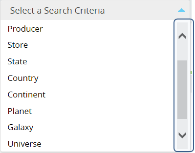
    The Select2 is a quite useful and fancy replacement for ordinary Html Selects. Having a fixed number of items available to pick, you may want to make the dropdown of a Select2 control vertically wider to avoid extra scrolling.

Before - Select2 With Scrolling

Where the Select2 control is defined as follows

<select name="criteria" id="criteria">
	<option value="">Select a Search Criteria</option>
	<option value="Product">Product</option>
	<option value="Producer">Producer</option>
	<option value="Store">Store</option>
	<option value="State">State</option>
	<option value="Country">Country</option>
	<option value="Continent">Continent</option>
	<option value="Planet">Planet</option>
	<option value="Galaxy">Galaxy</option>
	<option value="Universe">Universe</option>
	<option value="Reality">Reality</option>
</select>
	$("#criteria").select2({
		minimumResultsForSearch: -1 // allows to hide the type-ahead search box,
		                            // so the Select2 acts as a regular dropdown list
	});

Whenever the Select2 has been clicked, the dropdown-elements will be dynamically added to the DOM at the end of the body-tag and will pop up. To make the dropdown wider we need to apply the proper ccs style to it. Of course, we can change the default css styles accompanying the Select2 control, but there is a way to apply desired changes to a certain control, not affecting other Select2 controls on the page. The custom css class can be attached to the target dropdown by the following call:

	$("#criteria").select2({
		minimumResultsForSearch: -1,
		dropdownCssClass: "verticallyWider" // the dropdownCssClass option is intended 
                                            // to specify a custom dropdown css class
	});                        

The Html markup dynamically added to the DOM when clicking the Select2 resembles the following (note the verticallyWider class, which among others has been applied to the outer div-tag):

<div class="select2-drop-mask" id="select2-drop-mask"></div>

<div class="select2-drop select2-display-none verticallyWider select2-drop-active" 
	id="select2-drop" 
	style="left: 828.49px; top: 112.61px; width: 300px; bottom: auto; display: block;">
	<div class="select2-search select2-search-hidden select2-offscreen">
		<label class="select2-offscreen" for="s2id_autogen2_search"></label>
		<input class="select2-input" id="s2id_autogen2_search" role="combobox" 
			aria-expanded="true" aria-activedescendant="select2-result-label-8" 
			aria-owns="select2-results-2" spellcheck="false" aria-autocomplete="list" 
			type="text" placeholder="" autocapitalize="off" 
			autocorrect="off" autocomplete="off" />
	</div>
   <ul class="select2-results" id="select2-results-2" role="listbox">
      <li class="select2-results-dept-0 select2-result select2-result-selectable" 
		role="presentation">
         <div class="select2-result-label" id="select2-result-label-3" role="option">
			<span class="select2-match"></span>Select a Search Criteria
		 </div>
      </li>
      <li class="select2-results-dept-0 select2-result select2-result-selectable" 
		role="presentation">
         <div class="select2-result-label" id="select2-result-label-4" role="option">
			<span class="select2-match"></span>Product
		 </div>
      </li>
      <li class="select2-results-dept-0 select2-result select2-result-selectable" 
		role="presentation">
         <div class="select2-result-label" id="select2-result-label-5" role="option">
			<span class="select2-match"></span>Producer
		 </div>
      </li>
      ...
      <li class="select2-results-dept-0 select2-result select2-result-selectable" 
		role="presentation">
         <div class="select2-result-label" id="select2-result-label-13" role="option">
			<span class="select2-match"></span>Reality
		 </div>
      </li>
   </ul>
</div>

The verticallyWider class, in turn, is defined as the following (so, specify the desired min/max heights in the styles):

.verticallyWider.select2-container .select2-results {
    max-height: 400px;
}
.verticallyWider .select2-results {
    max-height: 400px;
}
.verticallyWider .select2-choices {
    min-height: 150px; max-height: 400px; overflow-y: auto;
}

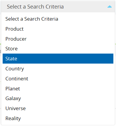
Below is the result of the modifications

After - Select2 With No Scrolling - Vertically Wider